The 404 error has probably been encountered by anyone who functions even a little bit on the Internet. You want to access a page, but instead of what you were looking for, you get a 404 error message – not found, not found. The page may have been moved, for example, or you may have typed in the wrong address. This message, to put it simply, can be cool or uncool. Give a good impression or a bad one. What are the four hundred and four that we encounter on the websites of marketing people and companies? We have made a compilation of examples and anti-examples.
We made the assumption that who is supposed to make cool four hundred fours, if not marketing-related individuals and companies? After all, an interestingly designed 404 error page is one of the elements of brand marketing. We’ve taken the domains under the microscope with our new ranking of the top 100 most visible sites in the marketing category.
What role does a 404 page play?
.
- First of all, it communicates that the user has reached a subpage that does not exist. The reason? Most likely, he clicked on an outdated link or misspelled the URL in his web browser (it could have been a simple typo).
- Previously, the user has not clicked on a link that does not exist.
- In addition to communicating that the user has gone astray, a 404 page can also serve a navigational function – indicating that from here one can, for example, return to the home page, go to product categories or other areas of the website.
- The 404 page also has a visionary role. The user is on a nicely crafted website. He browses, reads, clicks, he likes everything. Suddenly something goes wrong and he finds himself on a 404 page, and this page – clearly neglected. The effect is as if he was strolling through the nice streets of the old city, clean, well-kept, there you go, a cafe, elegant people, a store, lamp posts, and suddenly one wrong turn and a dead end street. And in the dead end street…. dark, dirty and probably someone peed. The user turns back. The problem is seemingly gone, but a mildly bad impression remains.
.
.
Were we right in assuming that four hundred and four marketing-related sites will always be dead ends, where not only is it clean and neat, but there are prompts, incentives and still a nice picture to please the eye? Not really. There is no rule. Some 404 pages in Polish marketing are simply OK. Others are very cool. And some deserve a definite thumbs down.
Let’s start with just those.
Just firstan important note. It is not our intention to stigmatize specific individuals or companies. Rather, we are pointing out what there is to improve. You may or may not benefit from these comments. In either case, don’t let the smile disappear from your face.
404 that lacked time or desire
.
The Mfiles site, after typing a non-existent URL, shows us this:
 .
.
That is, I tried to access a page that isn’t there and a small disaster happened. There’s no top menu, no logo, generally no more Mfiles page – instead, there’s a cool sign in English, on a precipitous white space, informing of an error. Brr.
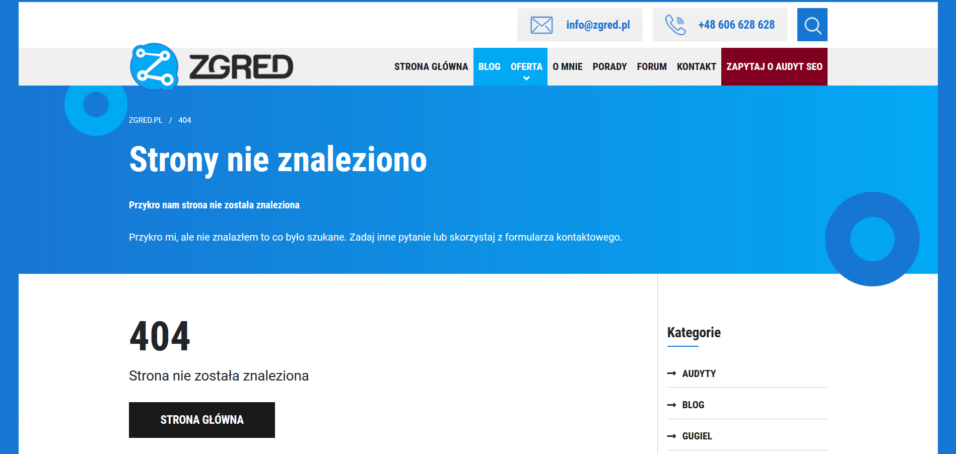
On the other hand, on this four hundred and four we have “Sorry for us”. Lower down we have “Sorry” and “I didn’t find that which was searched for” instead of “that which was searched for”. And just to clear up any doubts, we get a big 404 with “page not found”. It’s also good that there’s a Home Page button so you can quickly jump to a place that isn’t weird.
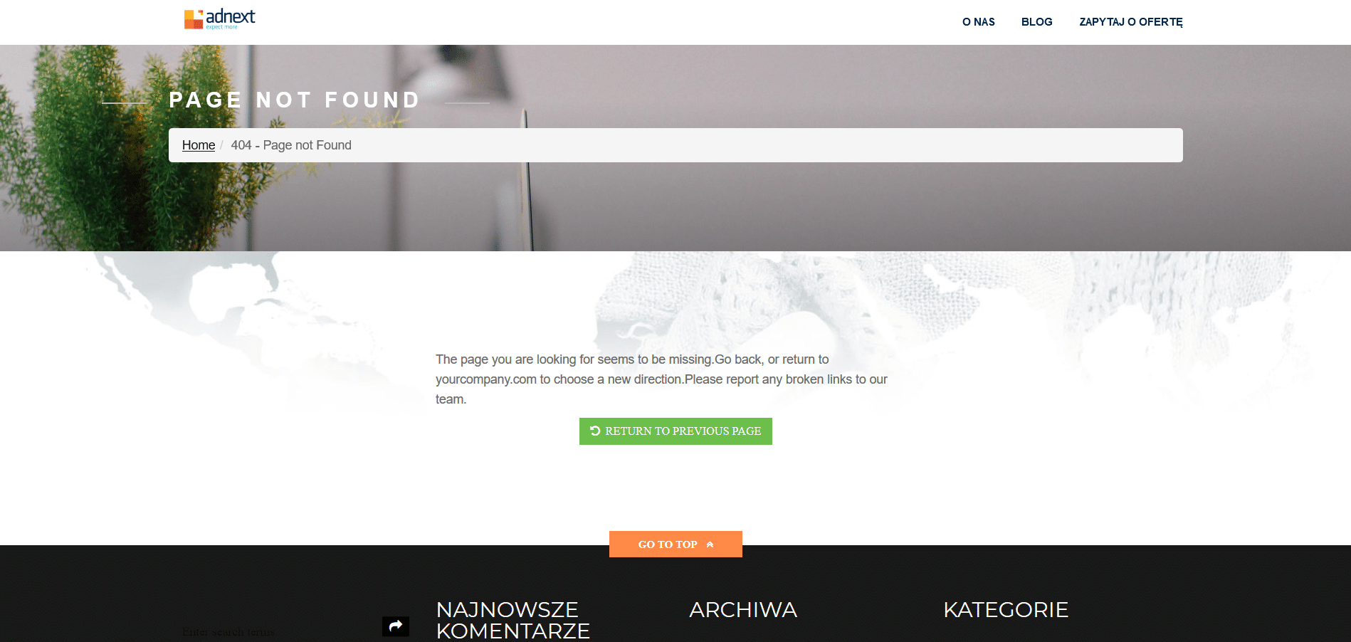
Here, by contrast, generic English text was used, with punctuation blunders, a random yourcompany.com address given (which is impossible to click on anyway), and a request that non-working links be reported to the team. Only without a clue as to what address the report must be sent to in order to fulfill this civic duty.
There are more quadrants in the marketing industry that would definitely be worth working on – but basically all of them replicate the mistakes seen above: either they are chaotic, or in English, or underdeveloped in one way or another, or all at once.
For a change, let’s now look at the better-conceived 404 pages.
404 without error (well, or with small errors)
.
What do the creators of 404 pages that we subjectively found cool/interesting/ok have in common? Mostly two elements: nice graphics or just neat design, and specific suggestions for the user. Now that you’re at this dead end, where can you go now, what can you do with yourself?
Bauer
.
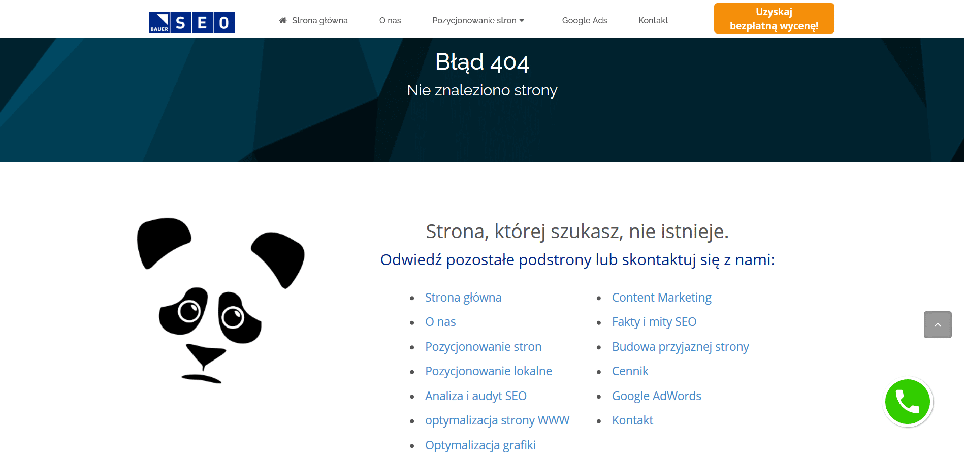
Bauer has a full set of proposals. And a panda who, instead of being happy that there are so many links to choose from, is sad that “The site you’re looking for doesn’t exist.” Don’t be sad, panda. You’re on a pretty cool four hundred and four.
Wild Moose
.
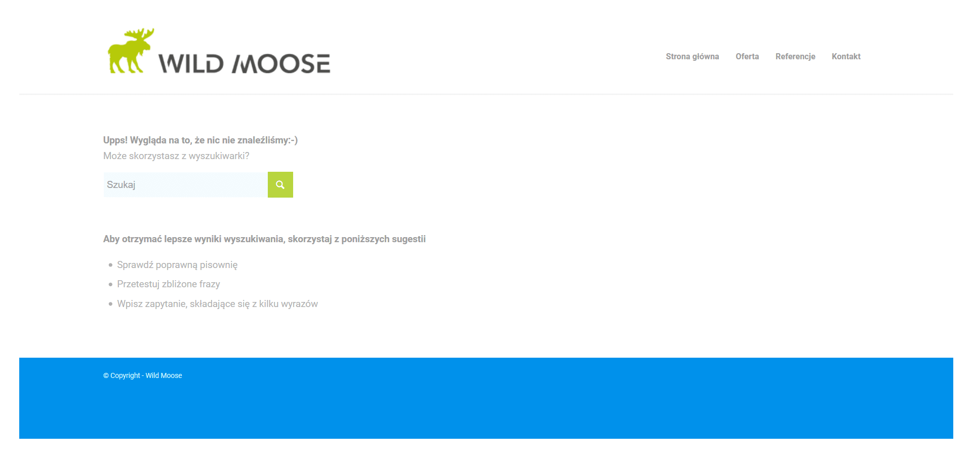
Staying in the zoological climate. Moose now. Wild Moose from Wild Moose. At their place modestly but pleasantly: a smile (because nothing of the sort happened), a search engine and a few hints about searching. Which, by the way, suggests that the four hundred and four at Moose’s is the same page that also shows up when you type an unrecognized phrase into their internal search engine. It could also be.
Sempire
.
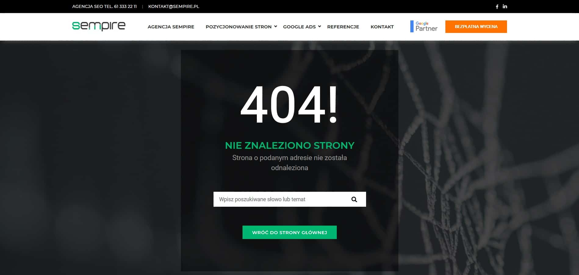
Things are similar at Sempire. Here, in addition to the search engine, we still have an error message. An image of some kind could be, but is not necessary.
Artifact
.

Oh, for that at Artefacts we have a picture. Quite creative, as it was supposedly about finding a website, and here is a lady searching through a closet full of clothes. And then there’s the suggestion of the latest articles from the blog.
Callpage
.
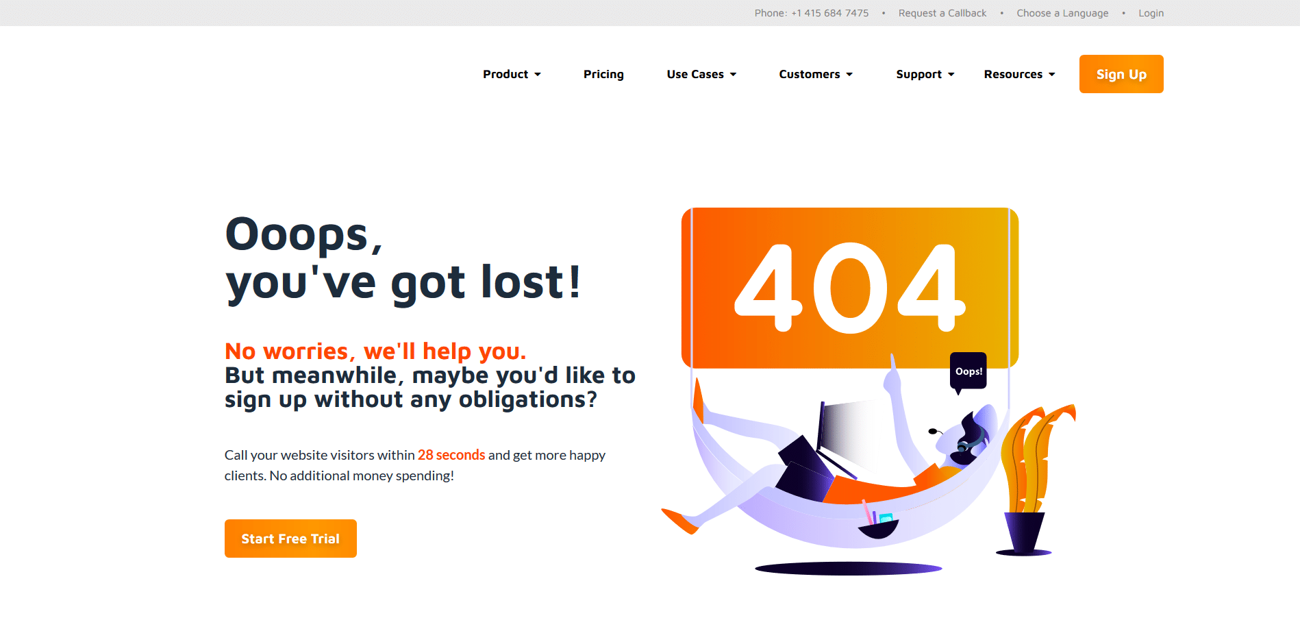
Callpage used an interesting trick – their 404 page has a CTA (call to action, or call to action) button. You’ve gone astray, but that’s okay, you can sign up for a free trial period and poke around with our service! Clever, clever. I wonder what the effectiveness of such a procedure is. As for the 404 page itself – Callpage operate not only in Poland, and that’s probably why the error message and CTA are in English. However, since I got to the four hundred and four from the Polish version of the site, it would be nice if it was also in Polish.
Owocni
.
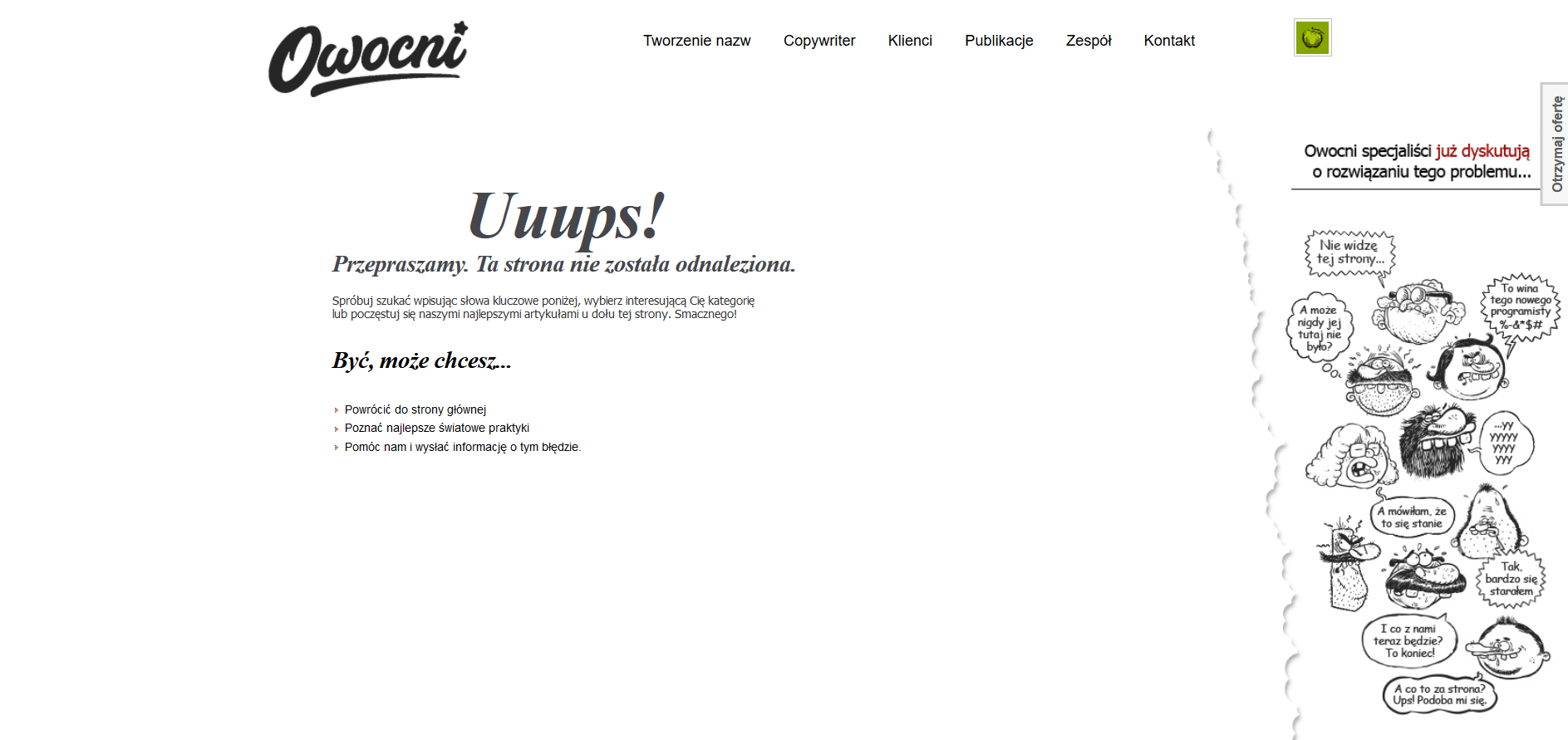
Fruits wins our poll in the Graphics category. Great that drawing on the right! And on the left are some links, though not very attractively provided. On top of that, Owocni writes about “treating yourself to the best articles at the bottom of this page.” – except that there are no articles at the bottom of the page. It could have been very good, it’s not bad.
(As an aside: why apologize if the four hundred and four is probably the result of user error?)
Cyrek Digital
.
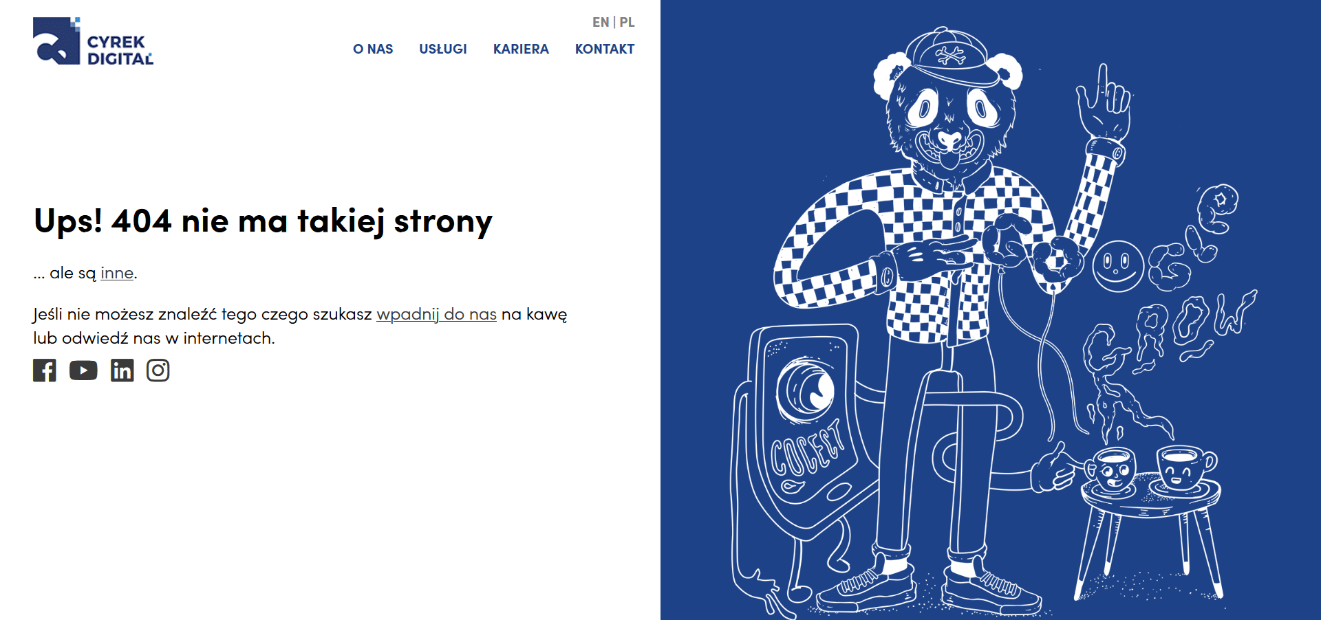
Cyrek Digital with their bear on LSD (?) definitely get a thumbs up from us! Maybe we’ll stop by for that coffee sometime, now that we’ve visited the four hundred and four. Just don’t add anything to it, okay?
New Marketing
.
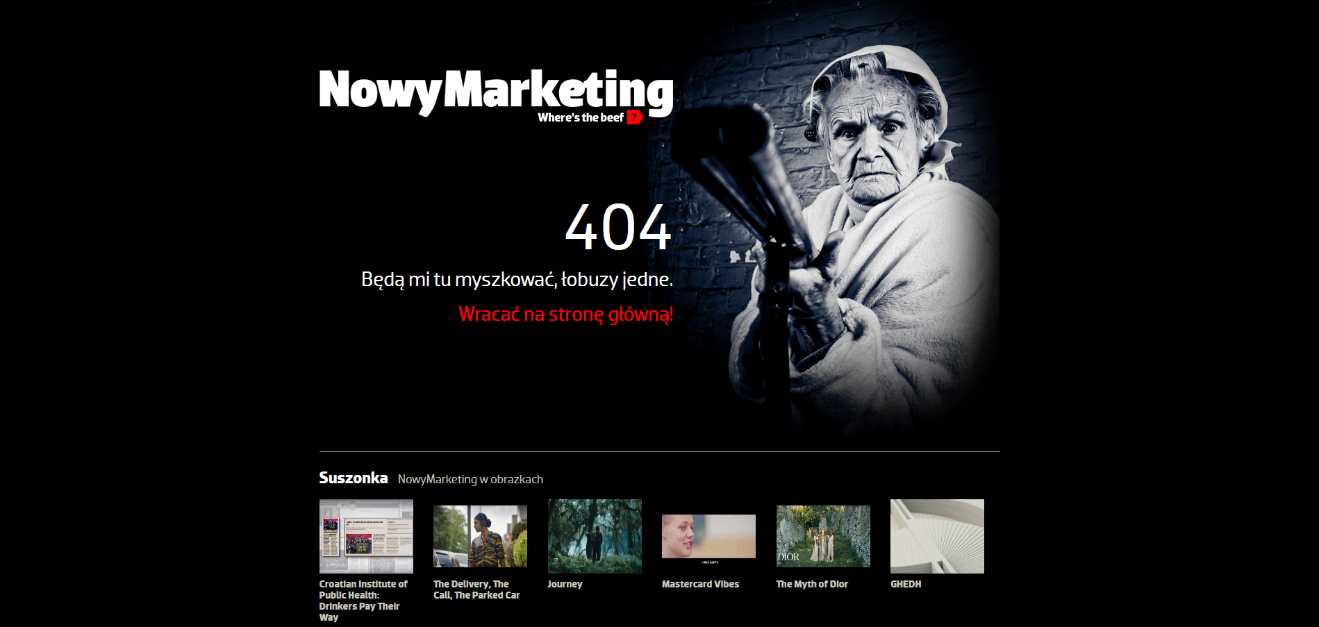
And we ourselves no longer know which is better – a teddy bear on acid, or a ferocious old lady with a shotgun? The level of absurdity (positively understood) similar.
Marketing Factory
.
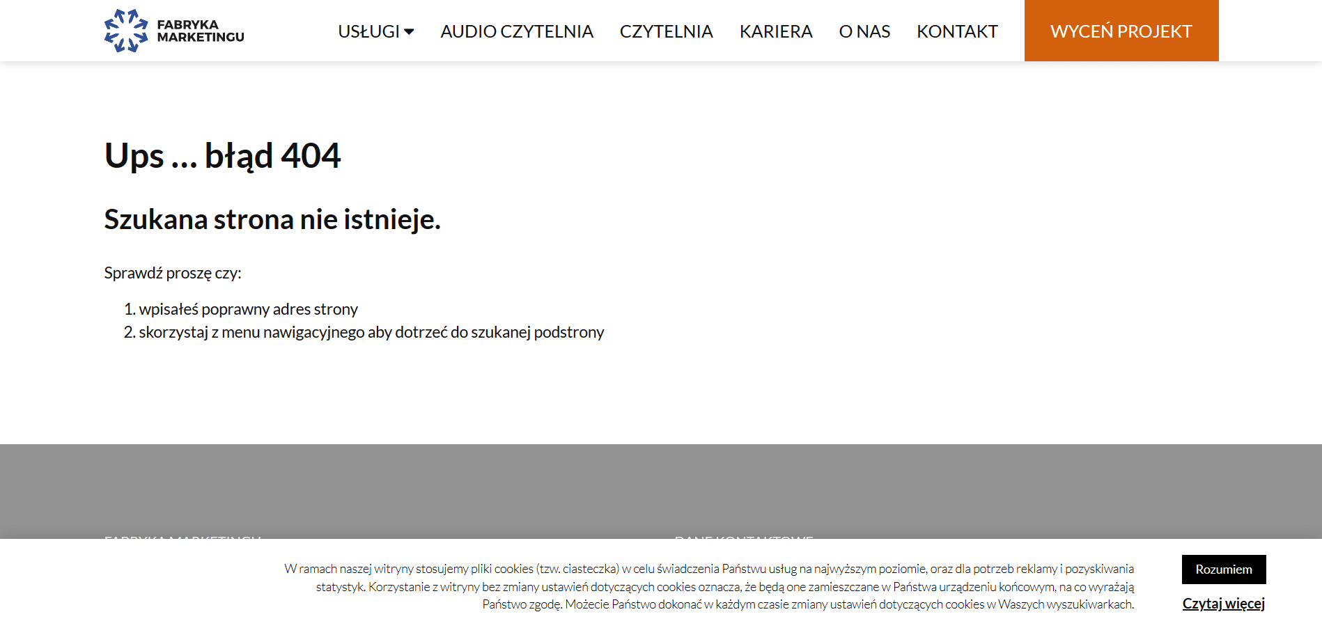
Noteworthy is the 404 Marketing Factory. It employs something that rarely appears on error pages, and could appear more often: the suggestion that maybe the user just misspelled the page address and it’s worth taking a look. It makes sense.
Marketer Plus
.
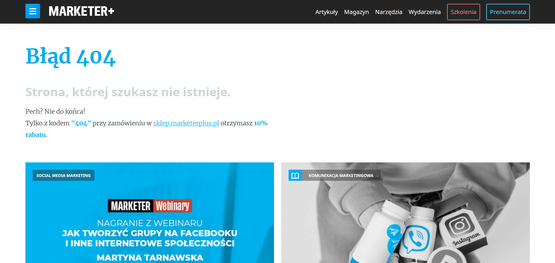
And finally, the four hundred and four siteMarketer Plus. The user gets a reward for getting lost! And all the negative emotions, all the negative internal dialogue – but I suck, but I got lost, but I can’t surf the Internet – is replaced by the joy of receiving a discount code. The team from Marketer Plus, you unofficially win our unofficial poll!
 Wojciech Maroszek