Customers of your clothing store interact with them on a daily basis. They are the primary source of information about the product and the processes involved in buying it. They help users make a final purchasing decision. They are also an ideal place to place keywords closely related to the assortment offered by your store. We are, of course, talking about product cards.
What elements should your fashion e-commerce product page contain, and what are the benefits of optimizing it properly? You can learn all about it right now!
The perfect product page – so what kind of one?
.
With the ever-growing online sales sector, the demands of customers who choose to shop in this channel are increasing. They are primarily concerned that the whole process should be similar to the traditional method of purchasing products in stationary stores, and thus – an equally rich experience.
The ideal product page should therefore be a place where the user will find valuable information about the product and answers to the most important questions related to it. A properly optimized product page directly influences a user’s positive experience during the shopping process and indirectly increases conversions in your online store.
Remember – each branch of e-commerce has different elements that need to be considered during the product page optimization process. There is no single proven recipe for a product page that will meet the needs of both fashion and, for example, automotive customers.
What are the benefits of a properly optimized product card?
.
A properly optimized product page in the fashion industry is one that…
.
-
Displaying itself in search results, through an interesting description and augmented elements, encourages a click and a purchase just as a good salesperson would do in a stationary store – the result? A marked improvement in CTR and increased site traffic.
-
Gets good use of SEO optimization to collect organic search traffic from relevant and precise sales phrases, not just those related to our brand.
-
It captivates, evokes emotions (just like in a stationary store) and brand affection. It is the kind of product and brand advertising you can be proud of.
- .
-
Assists in shopping and guides the buyer “by the hand” – navigates with a useful interface and actively engages the user, e.g. through calls to action, dynamic recommendations. Educates about the product and brand. Do you see an analogy to a stationary store here as well?
.
.
So we have two main goals that product card optimization will help us achieve:
-
increase traffic from search engines – by optimizing SEO and increasing CTR;
- .
-
increase quality of traffic – improve e-commerce conversion rate through improved user experience and optimization for relevant, sales keywords;
- .
15 key elements of a product sheet in the fashion industry
.
1. URL
.
A URL is a string of characters that you type into your browser’s address bar to reach a website. It conveys valuable navigational information to the user right from the search results. Therefore, when designing a friendly and correct URL structure, make sure it is:
-
logical – build an architecture of logical and relevant directories that facilitate user navigation and provide context to the search engine;
- .
-
short and concise – avoid complex structure and unnecessary directories, such as: “menu”, “category”, “collection”, “all”, “products”;
.
-
visually appealing – use clear addresses instead of dynamic parameters, and put descriptive product names containing keywords in place of product codes.
Remember – updating the URL structure of an existing website, even if it seems logical and beneficial to the user, in most cases is not cost-effective and recommended, if it can be avoided. It requires individual SEO analysis and a solid business foundation, followed by implementation according to good SEO practices.
.
Friendly URLs are not enough. Make sure your product is only available at one address. Harmful duplicate content (duplicate content) can occur, for example, when a product is assigned to multiple categories, based on which its URL is structured, or when the selection of a variant/size of a particular product results in a change of address. In such cases, the HTML tag named “rel=canonical” comes to the rescue, thanks to which we indicate the URL with the original content.
You also surely want Google to find all the URLs of your products, including those deeply hidden in the structure of the page. So create an up-to-date sitemap of your site in XML or HTML format using available plugins and wizards and submit it to the Google Search Console tool.
2. Meta data and structured data
.
These are the first pieces of information describing a page that customers will see when our product is displayed to them in a search engine. They are placed in the HTML code of the page. Whether a customer visits your site or a competitor’s site depends largely on these small bits of information. Fortunately, there are proven ways to attract user attention and increase the click-through rate (CTR).

Meta title (page title) – is the most important tag you should focus on when optimizing your product page. It strongly influences search engine positions, so it should contain well-chosen keywords.
The most effective meta title design for a product page in the fashion industry is to put the main keyword phrase at the beginning, followed by additional product features, and finally the brand name. Everything should fit within the maximum visible length of the title, which is about 60-70 characters, or more precisely, 600 pixels. Try to make the title clear and sound natural. Avoid product codes, sizes and complicated proper names.
Meta description (page description for search engines) – affects CTR similarly to meta title. It should be written solely for the user and should complement the product features and strengths, as well as direct marketing elements.
For apparel e-commerce stores, colorful adjectives such as effective, beautiful, unusual, fashionable will work well. Also use calls to action (call to action), such as choose, check, buy, order. Be creative, stir up emotions! Interesting meta description will sell as well as a salesman in a clothing store.
Meta Open Graph -control how URLs are displayed when shared on social media.
Schema.org Structured Data – properly implemented schema will help enrich your product’s search engine presentation with so-called extended elements, i.e. reviews, product photo, video, price and availability information, FAQ list or how-to instructions.
3. Breadcrumbs
.
“Breadcrumbs” is a quaint name for an important navigation element showing the place in the site structure where you are currently located. They usually take the form of a horizontal category path at the top of the page. They are very important in SEO, and e-commerce users like to use them because they make navigation easier for them. Google often displays them in search results if it finds breadcrumbs more relevant than the path in the URL, or if the path in the URL does not include the directory hierarchy.
4. Header structure
.
Header tags is one of the most important elements of on-page SEO. There are 6 headings, from H1 to H6, of which H1 is the most important. They greatly affect both SEO and page rankings in Google, as well as the usability of the product page. Despite this, a large proportion of e-commerce sites do not use them correctly.
.
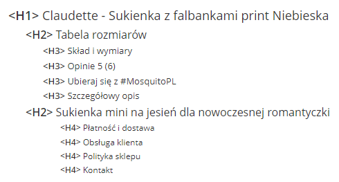
Headers help users and search engines read and understand the content on a page. Contrary to popular belief, they should not be treated as stand-alone elements, but as signposts that tell what the topic of the following paragraph is. Optimization will only have a greater effect than simply using a keyword when the headline is linked to the surrounding text.
Example of correct heading structure on a product card:
.
-
H1 – name of the product, including basic features such as color, material, intended use;
.
-
H2 – headings in the product description, if it is long, it is worth dividing it into sections containing keywords relevant to the description;
-
H3, H4 – they are usually not necessary for a product page, but you can use them, for example, for FAQ items;
.
.
You can verify the header hierarchy, for example, with the help of the Google Chrome plugin “SEO META in 1 CLICK”. Pay attention to whether the header structure on the product page gives useful information to the search engine about the important sections of the product card. Check that the H1-H2 headings don’t contain unnecessary elements that don’t apply to the product card or don’t contribute any context, but reduce the importance of the other headings of a given level.
.
5. Product name
.
This is not only one of the elements that first strikes the user’s eye as soon as the product card is opened. The product name contributes to its searchability on the Internet, and, properly optimized, it has a key impact on the positions of the product page, as well as category and subcategory pages related to the product range, in search results.
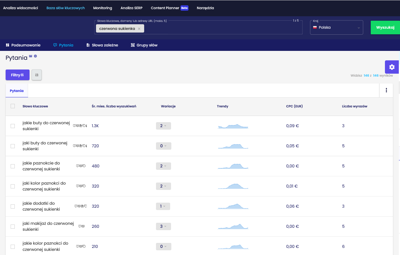
The process of creating a product name should begin by considering how a potential customer would search for it in a search engine. Keyword analysis is a fundamental part of optimizing a product page. Key phrase analysis tools such as Senuto equipped with keyword database are helpful in this process.
.
 .
.
Screen from Senuto Keyword Database – questions users type into Google related to the phrase “red dress”
.
A correctly optimized name does not only indicate the category to which the product belongs (e.g. women’s coat), but includes its most important features such as cut or material (e.g.wool double-breasted coat).
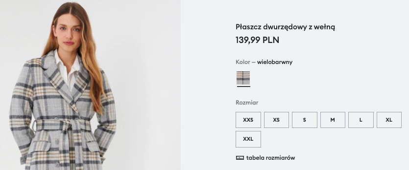
Correctly optimized product name on sinsay.com
Remember – use generic phrases when naming categories and subcategories. When creating product names, consider long tail phrases (long tail)which will allow you to indicate the specificity of a product and distinguish it from others.
See also: How to write category descriptions?
.
6. Product description
.
It can be called the heart of the product sheet. It is an elaboration of the features contained in the name of the product, and thus a collection of the most important information about its specifics. The Product Description is also an ideal place to insert key phrases and complementary phrases. Such practices positively affect the visibility of the product page and related categories and subcategories in search results.
But pay attention to whether keywords appear naturally in the content, as the product description is evaluated by both Google’s algorithm and your customers. Content saturated with key phrases will not be evaluated well by either side. Focus especially on the first piece of about 150 characters. Treat it as if it is the one to sell your product, as it is very likely to appear in search results. Also, don’t forget to properly format the text – paragraph division, bold or bullets will make the text more readable and pleasing to the user’s eye.
When creating a clothing product description, include elements such as:
.
-
A proper description – a collection of all attributes and advantages of a given product, presented to a potential customer in a way that encourages purchase;
- .
-
product features – a listing of the most important information about the product, so that the user gets to know it just as precisely, but without having to read a longer proper description;
-
the size presented on the product page by the model;
-
the size of the product (especially important for one size garments);
-
percentage composition;
-
maintenance method;
-
information on certifications (such as GOTS or OEKO-TEX);
-
availability in stationary showrooms;
.
.
.
.
.
.
.
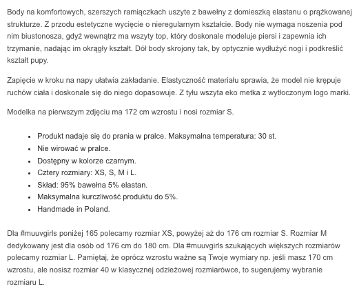
Example category description on muuv.pl
Remember – the product description placed on your e-commerce site should not be duplicated, for example, on marketplace pages or other product cards. A unique description will allow your site to achieve higher rankings in search results, while copying it leads to duplicate content, which is judged negatively by Google’s algorithm.
7. Visual product presentation
.
Besides the name and description of the product, this is one of the most prominent elements on its card. How can you present the product to make your customer feel like they are in a stationary store?”
Pictures – by far the most popular method of visually presenting a clothing product. Pay attention to whether the photos on your store’s website are of good quality, the right size, properly compressed, and have optimized alt attributes. The presentation of the product itself is also important. It should be photographed both on a model / model and in the form of so-called packshots. Also think about the possibility of adding a photo of the product from a 360-degree perspective.
Check out: How to optimize for SEO images on your site?
.
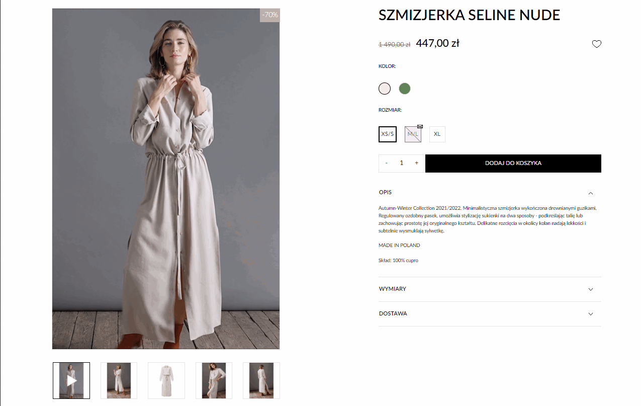
Video – an increasingly popular way of presenting clothing, which allows you to find out how a product looks on a silhouette in motion. Be careful, however, that it does not affect the loading speed of the page.
 .
.
Product presentation in video form at jemiol.com
Virtual fitting room – an augmented reality (augmented reality) achievement gaining popularity. After entering the exact dimensions of the silhouette into a dedicated generator, the application creates a digital 3D model of the customer’s image and allows you to “try on” individual items of clothing in a manner similar to shopping in stationary stores.
8. Product price
.
Prices in e-commerce cannot be a secret. They should be clearly visible on desktop and mobile devices, understandable and simple. If the product is on sale, it is worth presenting it in an attractive way.
Product pricing can vary depending on size, material and even color. The most common graphic solution is to show the range of possible prices from the lowest to the highest.
Customers need to trust your e-commerce to make a purchase. Transparency of price can be a critical element in gaining your customer’s liking and trust. That’s why some brands, such as Elements or Everlane, for example, have decided to be completely transparent about the price of their products and put an infographic under each product showing what makes up the price of the product.
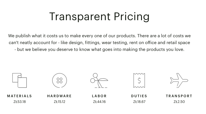
Transparent Pricing infographic at everlane.com
9. Size / size chart and color variations
.
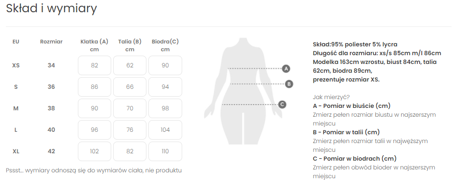
The product page should show all possible variants of the product in a convenient, preferably interactive way (sizes, colors, models, etc.). Very helpful information are size tables, such as the one presented by e-commerce Mosquito:
Are user experience issues all we can say about product variants? Unfortunately, this element is often implemented incorrectly in terms of SEO and causes many technical problems related to duplicate content. As we said earlier,the same or nearly identical content cannot appear at multiple URLs. This will lead to keyword cannibalization, by which we compete with ourselves and lose organic traffic. So a decision should be made:
-
whether we will create indexable product variations with unique descriptions and meta data;
- .
-
will we use anti-duplication solutions;
.
Choosing between these options requires a broader, individual technical audit and will depend, among other things, on our budget resources for writing the descriptions and whether there is demand for the product name searches we generate.
.
At first glance, it might seem that this is an element that does not require special attention during the process of optimizing a product card in the fashion industry. However, it is this one inconspicuous button that makes the desired product appear in the customer’s shopping cart.
When designing a product card, pay attention to whether the button is the right size and whether it is above the scroll line of the page. Equally important is its color (eye-catching) and its response to the cursor (such as lighting up). Also, don’t forget a phrase that encourages purchase (call to action) such as “Add to cart” or “Buy now”.
11. Button to add product to wish list
.
This element is just as important as the add product to cart button. Why? Customers do not always visit a clothing store’s website to purchase a particular item. Sometimes the user (as in the case of stationary shopping) browses the store’s offer to, for example, find out what products are in the new collection.
The button to add a product to the wish list is an ideal solution for a customer whose eye has caught a particular item, but is not yet 100% convinced to buy it. On the product card, it is very often presented in the shape of a heart, which turns red when the cursor reacts. An alternative could be a button placed below the button for adding the product to the shopping cart, with an appropriate CTA, such as “Add to wishlist”.
.
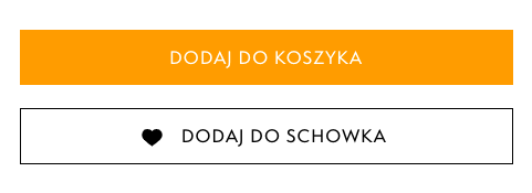
Buttons for adding products to cart and wish list on e-timberland.pl
12 Product reviews
.
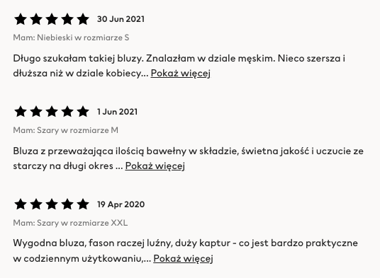
Customers of online stores very often look for reviews of a particular clothing product before making a purchase, and a large proportion of them take them into account when making their final purchase decision. That’s why it’s a good idea to put your customers’ reviews directly on the product card, as they affect credibility in the eyes of the user.
 .
.
13 Additional elements
.
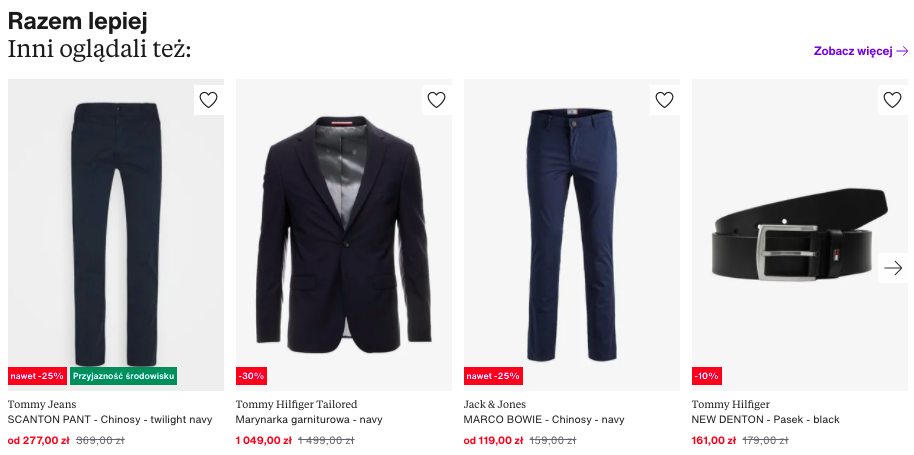
When a product card is properly optimized, a customer can purchase not only the item presented on it, but also other items of clothing in your store’s assortment. How to do it. Place recommendation sections at the bottom of the product page. This will increase user engagement and improve the positions of product pages in search results.
Create a set (cross-selling phenomenon) – this is a ssection that encourages the customer to purchase additional items that, in the case of the fashion industry, will complement the product they are viewing, creating an entire look. A customer aiming to buy an elegant shirt, for example, may be interested in suit pants, a jacket or a belt to complete the look.
 .
.
Recommendations on zalando.pl product card
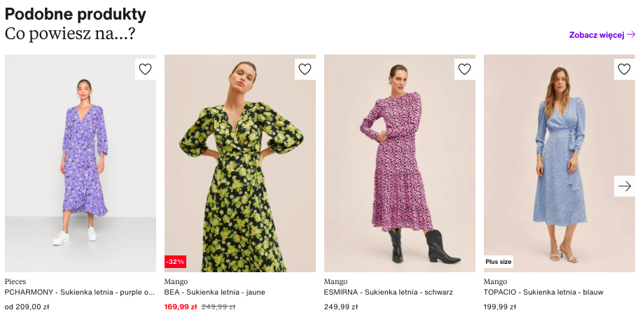
Inspire yourself (the phenomenon of up-selling) – this is a section that allows you to present the customer with items related to the item that is on the product card. Often, these items are on the higher end of the price scale, but, for example, have a better product composition. A customer who is just looking at a dress made of polyester may be willing to pay more, but buy a model sewn from natural fibers.
.
 .
.
Recommendations on zalando.pl product card
14 Payment, delivery and returns information
.
In addition to placing these elements in the footer, add them to the product card as well. Before making a purchase from an online store, a customer wants to know what payment and delivery options your service offers, as well as its current timing. Equally important is information on possible return of goods – how many days the customer is entitled to return the product and how they can do it.
.

screenshot from the calzedonia.com website
15 Production process information
.
The shopping awareness of customers of clothing stores is growing day by day. They are no longer only interested in information such as composition, but also the origin of the materials and the entire production process, especially whether it is done in the home country and in an environmentally friendly way.
If your brand operates in the spirit of sustainability, it is worth including this information on the product page. They are sure to be appreciated by your customers, and will positively impact your brand’s perception and position in the local market.
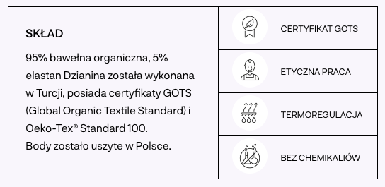
information about the production process at nago.com
Summary
.
A number of factors will determine the quality of product page optimization and positive marketing effects, and the best effect will come from a combination of many actions. An optimized product page can not only increase website traffic, but also sales and conversion rate among your e-commerce customers.
Finally, it’s also worth remembering that what seems obvious to the store owner is usually no longer so obvious to the customer and the search engine. This applies to the store’s interface, product information and countless technical aspects of SEO. It is worth basing business decisions not only on intuition, but also on user experience and research, such as UX audits and SEO audits.
Have you noticed deficiencies in optimizing basic product card elements such as meta tags, product names and descriptions, structured data or breadcrumbs in your fashion e-commerce? Or are you not using the potential of elements that improve user experience and those that increase user engagement? If the answer is yes, it means that your competitors who are using their potential are at least one step ahead of you and are not looking back. So take a step forward – the best time is right now!
.
 Martyna Barton