 Kate Parish
  Published: 12.08.2024
  11 minute
 How can you boost your website’s rankings in mobile search results? Consider implementing mobile SEO. This aspect of a search engine optimization strategy is gaining more traction. The process includes multiple steps, such as improving website speed performance, optimizing content for voice search, streamlining navigation, and more.
On this page, we’ll get to the nitty-gritty of mobile SEO, explain why it’s such a big deal now, and share ten practical mobile optimization tips.
Why Businesses Can’t Ignore Mobile SEO
Mobile devices are transforming people’s browsing behavior. According to Statista, nearly 60% of web traffic now comes from smartphones. This shift forces businesses to adjust their websites for mobile users. Otherwise, they can miss out on a large percentage of potential clients.
Another reason for building a mobile-friendly site is Google. Since 2020, the search engine giant has been using mobile-first indexing, i.e., the mobile version of a website counts as the main source for ranking and indexing. Even if your website has separate mobile and desktop URLs, Google algorithms will look at a mobile version to rank pages.
How to Configure a Website for Mobile
A mobile-friendly website has long become a necessity. To create one, you have three configurations to pick from: responsive design, dynamic serving, and separate URLs. Let’s focus on each option and explore its peculiarities.
Responsive Design
This design pattern sends the same HTML code on a single URL and automatically adjusts content to different screen sizes (smartphone, desktop, or tablet). Google recommends opting for a responsive design, as it’s easy to implement and maintain. There are a few more benefits to this configuration:
- Eliminates duplicate issues as there’s a common codebase and URL for all devices.
- Avoids redirects to show users a mobile-optimized page.
- Saves the crawl budget since Google bots need to process only one version of your page.
Dynamic Serving
This method involves serving different HTML depending on the user’s device. Meanwhile, the URL doesn’t change. Dynamic serving offers greater flexibility and granular control over content optimization for each device. However, there’s a catch. It requires a lot of time, effort, and expertise to maintain separate versions of web pages and ensure consistent user experience as well as proper search engine indexing.
Separate URLs
With this option, you set up different URLs for your website’s desktop and mobile versions. For desktop, it looks like “www.yourwebsite.com,” and for mobile — “m.yourwebsite.com.” When a person visits your site, the server detects the viewer’s device and navigates them to the appropriate version of the website. The main hurdle here is adding proper tags to your HTML code. Without them, Google won’t know which is the main version of a web page.
For mobile pages, you should use the rel=”canonical” tag pointing directly to the desktop version. In the meantime, the rel=”alternate” tag should be placed in the desktop page’s HTML code. It will instruct Google of an alternative version available for mobile users. By doing so, you’ll avoid technical SEO issues like duplicate content, which may hurt your rankings.
Best Practices for Developing a Mobile SEO Strategy
As more users surf the Internet via their smartphones, you want to ensure a stellar browsing experience for them. Mobile search engine optimization becomes integral to maximizing online visibility and attracting a larger mobile audience. This process implies a set of tactics, many of which overlap with desktop SEO practices. However, there are also some unique techniques. Let’s flesh out each tip and learn how to optimize your site for mobile devices.
1. Minimize Page Load Time
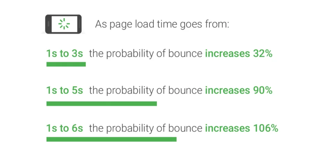
Mobile viewers expect immediate access to information. Hence, site speed is crucial for keeping users engaged. Each second of loading time can cause more visitors to ditch the page. A study by Google back in 2017 revealed that bounce rate probability jumps by 32% when page load time grows from 1 to 3 seconds. And the number skyrockets to 106% when load time goes from 1 to 6 seconds.
Not much has changed as of today. Lightning-fast websites have become the norm. How do you know your mobile site fits the bill? Use Google Page Speed Insights to highlight possible issues. This free tool will sort out all the information about your website’s performance and suggest ways to improve speed and UX.
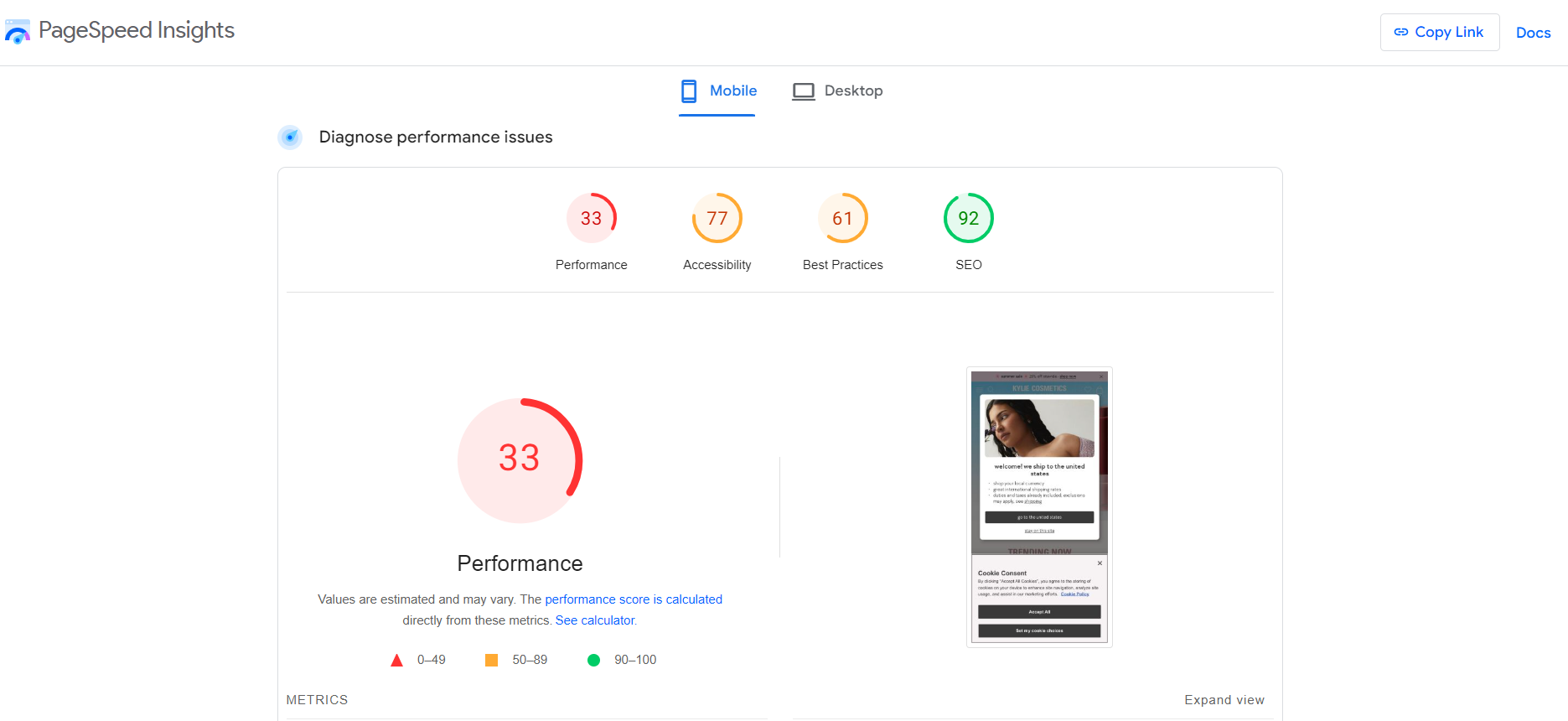
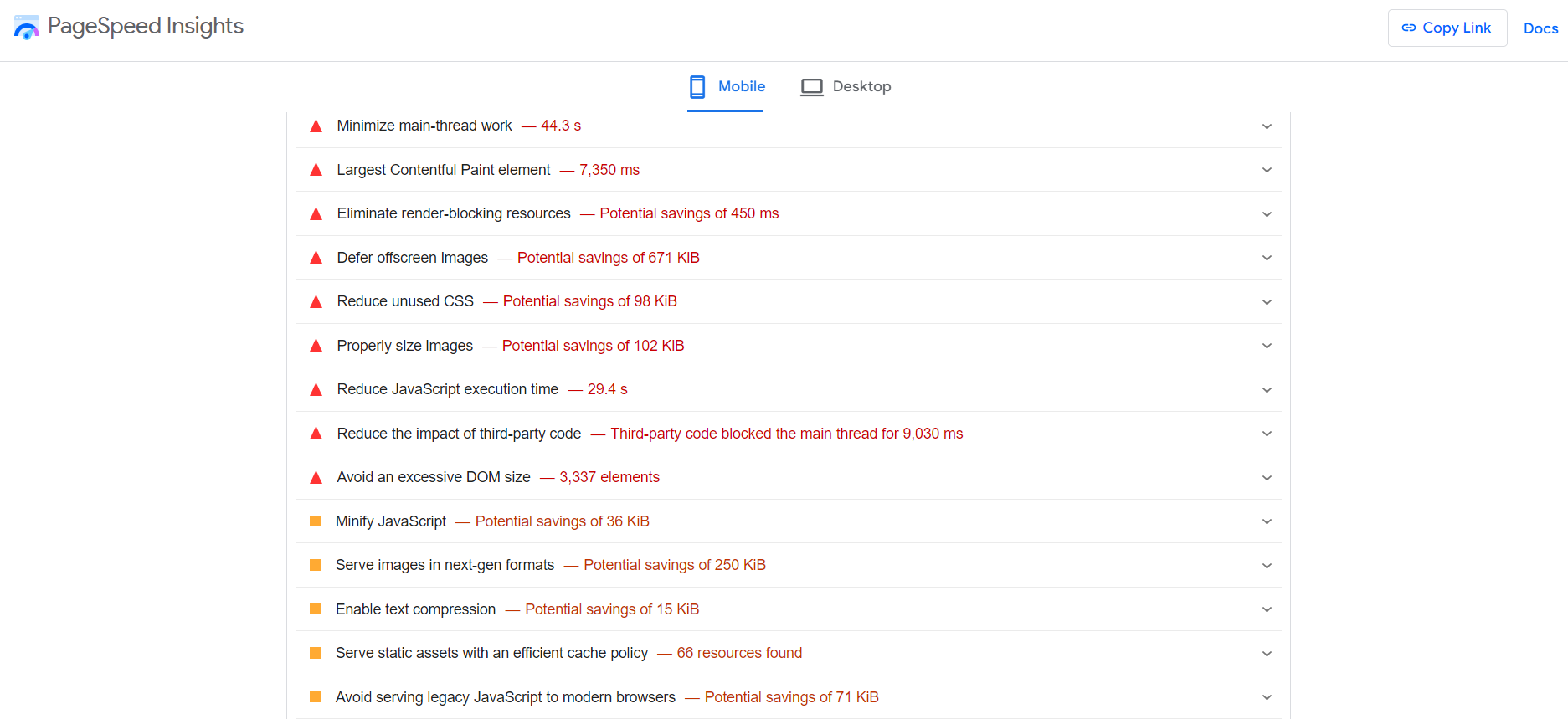
Once equipped with this data, you can implement the necessary improvements. It’s wise to rely on a team of experts who can fix the problems quickly and efficiently.
2. Prioritize an Intuitive User Flow
You want more mobile visitors to interact with your website. To accomplish this goal, focus on a frictionless user experience. Compared to desktops, mobile devices have smaller screens and touch-based navigation. You should factor in these unique characteristics to create a smooth user flow.
Mobile users navigate through touch gestures, primarily thumbs, so it’s essential to structure the layout and design for easy one-handed interaction. Leave enough space between clickable elements (buttons, links) to minimize accidental taps.
Given the limited screen space, font choice is crucial. It should be clear and legible, making it easy for users to read and comprehend the mobile content. Also, focus on large and compelling CTAs (calls to action). Use concise and straightforward language to encourage readers toward the desired action.
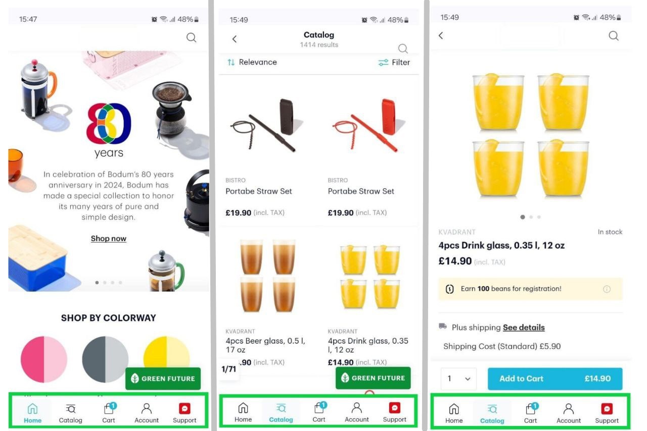
Navigation is another essential feature to consider when optimizing your website for mobile. A hamburger menu is a popular choice, allowing users to explore different website sections with a few taps. The primary rule is to include identical links in desktop and mobile navigation menus for a smooth browsing experience.

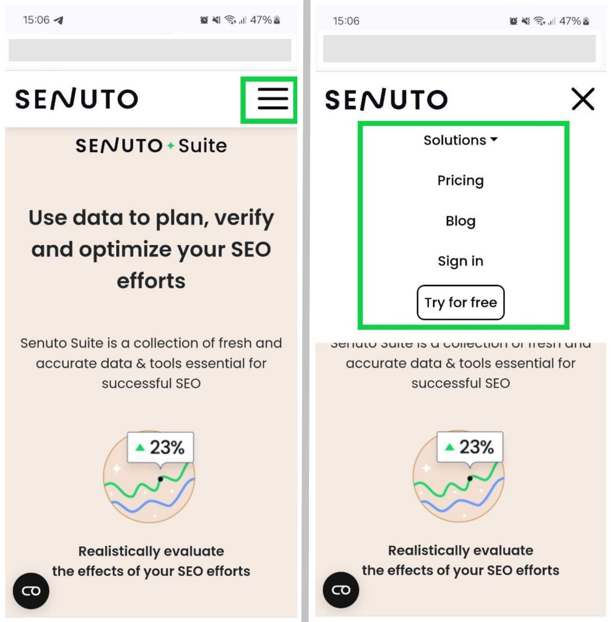
While people are more accustomed to a hamburger menu, alternative navigation styles, such as tab bars and side drawers, are gaining steam. For example, tab bars, also called bottom menus, are pinned to the bottom of the screen, giving users quick access to the main controls (home, cart, category, wish list).
3. Get Rid of Intrusive Pop-Ups
While pop-ups are great for grabbing users’ attention, highlighting key information, encouraging email sign-ups, or promoting special offers, they can quickly turn from helpful to harmful on mobile devices.

Therefore, use them carefully. On smaller screens, large pop-ups take over the entire space, making it difficult for visitors to find the information they need. As a result, users will feel frustrated and may bounce off. The best practices for implementing pop-ups include:
- Reserving them for situations when they add value, such as displaying relevant content when users scroll past a certain point.
- Limiting their frequency and size so as not to overwhelm and distract viewers.
- Incorporating a readily available exit button for users to dismiss the pop-up and continue browsing easily.
4. Structure Content for Small Screens
This is another crucial point of mobile search optimization. Nobody is eager to read large blocks of text when landing on a mobile site. As a rule, smartphone users tend to skim content, so it’s wise to break down long paragraphs into shorter, more digestible chunks. Ideally, each section should be no more than three sentences long.

Format your content to make it visually appealing and readable. Use bullet points, numbered lists, images, videos, and quotes. Ensure all media elements display properly and scale correctly on mobile devices.
5. Optimize for Local SEO
Mobile searches featuring phrases such as “near me,” “open now,” or “find [product/place] in [city]” are fairly frequent. To get more eyes on your business in local search results and attract more foot traffic, consider optimizing for local SEO:
- Sign up for Google Business Manager (former Google My Business), enter your business information, and verify ownership.
- Insert NAP (Name, Address, and Phone) details in the footer.
- Target location-based keywords and incorporate them into the website content, title tags, and meta descriptions.
- Encourage customer feedback on Google, Yelp, and other relevant platforms and respond to all reviews (negative and positive) professionally and in a timely manner.
6. Fine-Tune Title Tags and Meta Descriptions
Title tags and meta descriptions hugely influence click-through rates. These elements make a first impression on searchers. When optimized for mobile SEO, they can move your website up the SERPs (search engine results pages) and attract more organic traffic on mobile devices.
When it comes to title tags, you want to keep them short (between 50 and 60 characters). Add only one keyword to the headline, preferably at the beginning of the phrase. Strive to make them unique and catchy.

Meta descriptions give your audience a summary of the web page’s content. By looking at the meta description, mobile users can determine whether the search result is relevant to their query. Given the limited spacing on mobile screens, aim for short and explanatory meta descriptions (typically under 120 characters). Consider including a call to action or value proposition to drive clicks.
7. Tailor Content for Voice Search
Unlike desktop users, who can type in a query with keystrokes, many mobile device users opt for voice search to find the necessary information on the go. To capture this audience, you should optimize content in a voice search-friendly way.
Focus primarily on long-tail keywords phrased as questions (“Where can I buy organic vegetables near me?” instead of “organic vegetables”). Another pro-tip is integrating natural language expressions into the content and structuring it to give direct answers. Also, creating an FAQ section with commonly asked questions can enhance your voice search visibility.
8. Employ Schema Markup
Structured data, or schema markup, is crucial for mobile SEO. This code language helps search engines grasp the web page’s content and display relevant information on SERPs. With schema markup, you can add more details to the web page’s listing, such as reviews, ratings, pricing, etc. This way, you transform ordinary SERP snippets into rich results and maximize your chances of getting more clicks and generating organic mobile traffic.
9. Regularly Monitor Mobile Performance
Use Google Analytics to gain valuable insights regarding your website’s mobile performance. In GA, you can track traffic by device and see how users interact with your website.
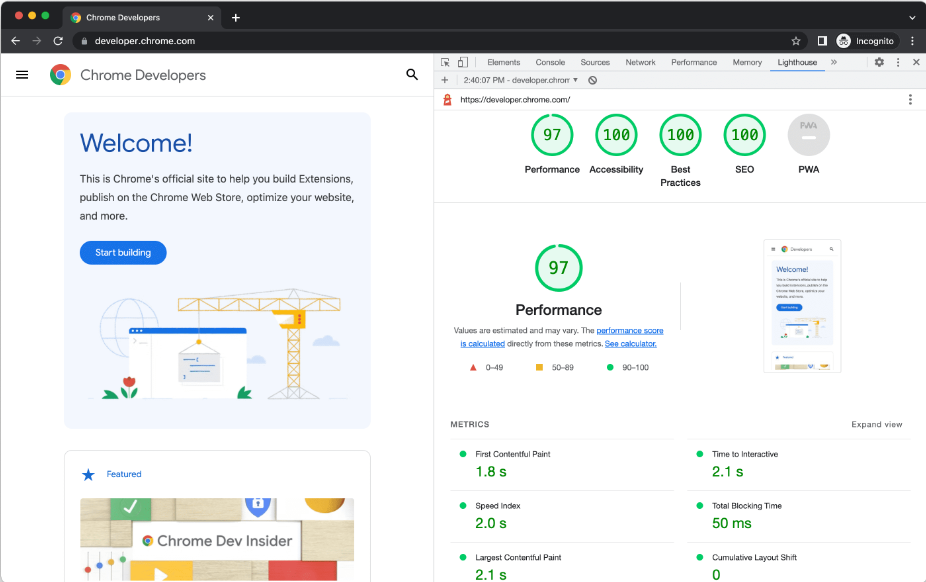
Lighthouse is another helpful open-source tool from Google. It automatically analyzes web pages by several criteria, such as performance, SEO, accessibility, progressive web apps, and more. You simply provide Lighthouse with a URL, and it starts running a comprehensive audit. After that, it creates a report with a detailed explanation of the issues detected and recommendations for resolving them.
10. Keep an Eye on Competitors’ Mobile SEO
Monitoring competitors’ techniques is always a good practice to stay updated and uncover areas for improvement in your own strategy. Using the appropriate tools can streamline the process and give valuable clues about your competitors’ tactics and performance.
You can do mobile searches for relevant keywords and see which sites rank the highest in Google. Pay close attention to their headlines and snippets. Use Google Page Speed Insights to assess how your mobile site stacks up against your competitors. While browsing the rivals’ mobile sites, keep a close watch on the user interface, navigation, and design choices for you to emulate.
Key Takeaways
Mobile search optimization is integral to business online success. The mobile audience is growing rapidly. If your website can’t deliver a stellar user experience on mobile devices, you’re essentially shutting out a huge portion of traffic and hurting your rankings in search engine results. The practical tips from this mobile SEO guideline can ramp up the website’s visibility, expand your audience reach, and secure top positions in Google.